# DVA Web Application
# Introduction
The DVA Web Application (opens new window) uses the Masterportal (opens new window) as a foundation for web visualization and mainly consists of two tools:
Each of these tools contains multiple steps that must be executed sequentially to configure the necessary settings.
# Decision Support

The decision support tool is based on a multi-criteria analysis and serves for interdisciplinary evaluation of service provision. It assesses accessibility to essential services such as supermarkets, schools, or medical practices, considering individual weightings. In the background, the system calculates accessibility layers using multi-criteria methods and visualizes the results as color-coded raster maps, allowing for quick assessments.
Example questions include:
- Land and resource conservation: Where is the best location for a new settlement area to efficiently utilize existing public services infrastructure?
- Service analysis: How well is a city's population supplied with grocery stores?
- Identifying service gaps: Where are there gaps in services, such as general medical care?
- Evaluating minimum standards: How many children cannot reach an elementary school within 20 minutes of travel time?
The following sections present the steps of the decision support tool. In the tool itself, a clickable button is located at the bottom center of each step, leading to the corresponding entry in the documentation.
# Step 1: Start Analysis
Choose between the button Start New Analysis or load an existing analysis via the button Load Analysis Settings. For the latter, you must select a corresponding file with the settings of the desired analysis from your local directory (Prerequisite: You have previously conducted and saved an analysis). The tool reads this file, and the stored settings are automatically adopted. The analysis can then be repeated.
Saving Analysis Settings
Files with analysis settings can be generated in Step 8.
# Step 2: Study Area
Select the study area for the analysis. Two options are available:
- Nationwide analysis
- Custom area selection
ToDo:
Nationwide analysis may no longer be part of this step, leaving only the custom area selection option.
Nationwide Analysis:
Although the nationwide analysis can be selected, it is not operational.
If the "custom area selection" option is selected, a custom study area must be defined in the map section. This is done by selecting the option, holding down the ctrl key, and drawing a rectangle on the map with the mouse.
All calculations will only be conducted for this study area.
20 km Buffer Consideration
All infrastructures within and up to 20 km outside the selected study area are included in the calculation. This prevents edge distortions in the map and ensures realistic service analyses.
Performance
Calculation time and waiting time depend, among other factors, on the size of the study area and increase with its size. Additional influencing factors include the number of infrastructures (Step 3: Infrastructures) and the size of service areas (Step 5: Accessibility Calculation).
# Step 3: Infrastructures
Select the infrastructures to be considered in the analysis. The infrastructures are divided into three groups: Retail, Health, and Education. Infrastructures from different groups can be mixed. All calculations will be conducted only for the locations of the selected infrastructures within the study area.
The number of selectable infrastructures is not limited. However, results from complex analyses with many different infrastructures may be harder to interpret.
Only one infrastructure type group can be selected at a time, as each type covers different healthcare needs. A combined analysis would therefore produce hard-to-interpret results.
# Step 4: Population
Select the age group(s) to be considered in the analysis. Information on the number of people per age group is available for population locations. This selection controls how many people on the demand side are included in the calculation.
There are two options: Standard Age Groups and Age Groups for Childcare/School Needs. This ensures better alignment with life phases and planning analysis needs. Age groups from the two options cannot be mixed.
An age group is defined by its upper and lower boundary. For example, there are age groups 18 to under 30 years and 30 to under 50 years, etc.
Clicking on the corresponding field allows the selection or deselection of age groups. A blue field means the age group is selected, while a gray field means it is not included in the analysis. The rightmost field represents the 65+ or 80+ age group. To consider the entire population, either activate the corresponding checkbox or select all fields.

# Step 5: Accessibility Calculation
The settings in this step control the calculation of accessibility to infrastructures for the population. This is done by setting the transport mode and defining accessibility zones.
Default Values
Accessibility zones have predefined expert-recommended settings based on legally defined minimum standards or relevant jurisprudence. These settings can be skipped if necessary to proceed directly to Step 6.
To reduce effort in this step, it is possible to apply settings for all infrastructures at once. For this, switch to General mode. Individual mode allows fine-tuning for each infrastructure separately.
Transport Mode
In the free version, only the car transport mode is available.
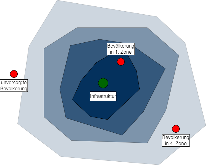
For each infrastructure, there are four accessibility zones. These are created at predefined time intervals around each location of the respective infrastructure. The quality of supply at population locations is then determined based on these accessibility zones (the closer to an infrastructure location, the better the supply). The accessibility zones are divided as follows:
- 1st Zone: very good supply situation
- 2nd Zone: good supply situation
- 3rd Zone: adequate supply situation
- 4th Zone: poor supply situation
Population locations that are not within at least the fourth zone (poor supply situation) are outside the defined limits and are considered not supplied.

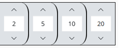
The size of each zone can be adjusted by modifying its boundaries. These (boundary) values indicate the travel time (in minutes) from the location to the outer boundary of the respective zone. The values are read from left to right: The left value defines the smallest zone (very good supply situation), and the right value defines the farthest zone (poor supply situation).
For example, if the values are 2, 5, 10, 20, the first zone includes all locations that can be reached from an infrastructure location within 2 minutes. The second zone covers the area that takes at least 2 but at most 5 minutes to reach, and so on. All population locations farther than 20 minutes from an infrastructure location are considered not supplied. The values can be adjusted using the arrow buttons above or below them. The upper button increases the respective value, while the lower button decreases it.

ToDo
It might be helpful to reference other parts of the documentation here, such as the section on Methods and Expertise.
# Step 6: Weighting
Assign individual weights between 0 and 100 to the selected infrastructures. Each infrastructure has a slider to set the weight. The left end corresponds to a weight of 0, and the right end to a weight of 100. A higher weight means a greater influence of the infrastructure on the final result. Simply put, if an infrastructure is weighted at 50, all accessibility values associated with it are multiplied by 0.5 if at least one weight is set to 100.
To simplify operation, buttons above the sliders allow setting all infrastructure weights directly to 0 or 100%.
Displayed Infrastructures
Only infrastructures selected in Step 3 are displayed.
0 Values
An infrastructure with a weight of 0 is not considered in the analysis.
Equal Weights
If all weights are the same, the exact value has no impact on the result. Whether all infrastructures are weighted at 50 or 100 does not affect the result grid – it remains unchanged as long as all infrastructures have the same value.
# Step 7: Summary
In this step, you receive an overview of all selected settings.
First, the age groups chosen in Step 4 are displayed. Below is an overview of the infrastructures selected in Step 3. The respective weight from Step 6 is displayed next to the infrastructure names.
Clicking on an infrastructure name or age group reveals more information. Here, the selected age groups and accessibility calculation settings from (Step 5) can be viewed.
Clicking Start Analysis initiates the calculation. Subsequently, Step 8 is unlocked with further analysis functions.
Displayed Infrastructures
For simplification, only infrastructures selected in Step 3 are displayed here.
Changing Settings
Settings can only be changed in the respective steps. This step is for overview purposes only and does not allow modifications.
# Step 8: Results
Development Stage
Some parts of Step 8 are still in development or are considered previews. Therefore, some features may not function as expected.
This final step of the tool allows for a more detailed analysis of the results or saving the analysis parameters to the local file directory using the Save Analysis button.
Once the calculation is complete, a raster representation appears in the map window, and additional functions are unlocked.
Under Display, checkboxes allow selecting whether to show the overall result of the multi-criteria analysis (supply situation for all infrastructures) or the partial result for a specific infrastructure. Additionally, it is possible to switch from the raster view to a heatmap view.
Known Issue
Switching from the heatmap view to the raster view is problematic in the public version. A new click on Start Analysis may be required to reload the view.

The visualization in the raster shows the supply situation according to the selected infrastructures, parameters, and restrictions in a color gradient from green (good supply) to red (poor supply). A heatmap, on the other hand, visualizes the intensity or frequency of values in space (here green). This can reveal spatial patterns, trends, or hotspots in the data. A higher color intensity represents a higher value density. Green indicates a relatively good supply situation, while red indicates a poor one. A thorough interpretation requires knowledge of the specific contexts and parameters displayed. We generally recommend using the heatmap for an overview and pattern recognition and the raster representation for a more detailed analysis.
The following additional functions are available in this step:
- Statistics:
- Scenarios and Simulations
# Spatial Access

The Spatial Access tool offers an innovative method for accessibility analysis in healthcare. Using gravity-based approaches, it evaluates not only the accessibility of infrastructures but also their capacities. As a specialized planning tool, it has been prototypically developed for the DVA in the outpatient healthcare sector to enable realistic and practice-oriented analyses. Analyses in other public service sectors are possible but require different specific background data on capacity.
ToDo
Expand the documentation as the Spatial Access tool is further developed.
# Step 1: Start analysis
# Step 2: Select physicians and area
# Step 3: Define participate and capacity
# Step 4: Select age groups
# Step 5: Select transport mode and distance weighting
# Step 6: Results
ToDo
Expand the documentation as the Spatial Access tool is further developed.
# Statistics

Statistics in the DVA help maintain an overview: they show how well the population is connected to essential public service facilities.
- Who cannot reach a facility within the desired time or distance?
- Where are there gaps in service provision?
- Are there areas where a particularly high number of people live who would benefit from a new service center?
- Which location is best suited for site selection?
Under Evaluation and Statistics, two or three visualizations are displayed, depending on the selection made in the display options.
# Number of Accessible Infrastructures at Place of Residence
The first figure, Number of Accessible Infrastructures at Place of Residence, represents the population count in relation to the number of accessible infrastructures. Zero values indicate no access to any infrastructure (gray areas on the map). This means that these population locations are outside the accessibility thresholds defined in previous steps.
The diagram can be interpreted as follows:
In the study area...
- 73,000 people have access to two infrastructure facilities...
- 13,000 people have access to one infrastructure facility...
- 1,000 people have no access to any infrastructure facility...
... within the previously defined minimum accessibility thresholds.
# Quality of Service at Place of Residence

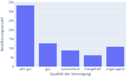
The second figure, Quality of Service at Place of Residence, represents the population count based on service quality. If population locations fall within the previously defined accessibility thresholds, their service situation is rated from very good to poor. It is considered inadequate if residents are outside the accessibility thresholds. This figure is only available when individual infrastructures are analyzed. If aggregated service situations (multiple infrastructures combined) are displayed in the map window, statistical evaluation is disabled to prevent mixing incomparable data in a single diagram.
The diagram can be interpreted as follows:
In the study area...
- 34,000 people have a very good...
- 12,000 people have a good...
- (and so on)
- 11,000 people have an inadequate...
... quality of service based on the previously defined accessibility thresholds.
# Service Quality and Location
Fig: Interaction between statistical diagram and map display.
The third figure, Service Quality and Location, represents the population size of each 100x100 m population cell along with the service quality. The service level is normalized between values of 1 and 0, where 1 indicates a high service level and 0 represents a low service level. These values are derived from the assigned accessibility thresholds. If multiple infrastructures are involved, the values are summed.
An example reading: In the figure, values between 0 and 2 are shown on the y-axis. This is because two infrastructures were selected in previous analysis steps, and some people live in nearly perfect proximity to two locations. In such cases, their grid cells receive a high service value (e.g., 1.8). The y-axis represents the population count within each population cell.
The diagram interacts dynamically with the map, helping to understand the spatial distribution of attributes shown in the diagram. To influence the map, follow these steps:
- Click on Select Box in the top-right corner of the diagram.
- Draw a rectangle within the diagram using the mouse. All locations inside the rectangle will then be highlighted on the map.
This allows for analysis of, for example:
- Whether clusters in the scatter plot also represent spatial clusters.
- Whether poor service levels correlate with high population densities.
- And much more.
# Scenarios and Simulations

Scenarios allow for designing the service landscape as if on a blueprint. What happens when a new location opens? How does the relocation or closure of a site affect the overall system? And which option is best if only two out of three locations are viable? Such analyses support informed decision-making for optimal service provision.
Under Simulation, the Scenario Mode is available. This mode allows adjustments to service locations and simulations of scenarios that do not yet exist in reality.
In the opened Scenario Mode, an existing scenario can first be loaded, or a new one can be created. Next, the infrastructure to be modified must be selected. Available infrastructures are those previously considered in the analysis. After selection, the locations of the infrastructure within the chosen study area (Step 2) are displayed on the map. For the selected infrastructure type, the following options are available: Edit features (modify site positions), Add features (add new locations), and Remove features (delete locations). Depending on the chosen option, the dataset can be modified directly on the map using the mouse. For example, if "Edit features" is selected, infrastructure locations can be repositioned by dragging them on the map. Clicking the "Start Scenario Analysis" button will rerun the analysis incorporating the changes.
Known Issue
In the public version, selecting existing scenarios is not possible.
In the Optimize Locations section, optimization can be configured by selecting a coverage criterion and a coverage target. The optimization algorithm attempts to arrange the selected infrastructure locations so that the given criterion is met for at least the specified percentage of population locations. Clicking "Start Optimization" runs the optimization process.
